Tokyo 2020 Logo Font

The 2020 Summer Olympics, commonly known as Tokyo 2020, is a major international multi-sport event due to be held from 24 July – 9 August 2020 in Tokyo, Japan.
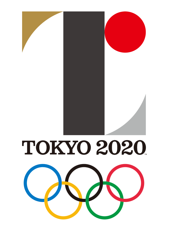
On 24th of July, 2015, the emblems for both the Olympics and Paralympics were presented via a special event in Tokyo, exactly 5 years before the Olympic opening ceremony. Both the Olympic and Paralympic symbols were designed by Kenjiro Sano, a graduate of the Department of Graphic Design at Tama Art University and winner of many graphic design awards such as the New York ADC Gold Award and the Cannes Lions Gold.
The Tokyo Olympic logo consists of the “T” symbol, the wordmark and the Olympic rings. The ‘T’ shape of the emblem embodies the three themes: Tokyo (the host city), Tomorrow (the ambition of the event to construct a better, more connected future for the world) and Team (the entire world unites as one team).
The “T” symbol is basically a combination of different geometric shapes. The central pillar in black represents tolerance and diversity, regardless of race, nationality or religion; The red circle symbolizes an all-accepting planet and it’s red color stands for a beating heart. It also not only alludes to the Japanese flag, but the geographic position of Japan on the world map: in the top right corner; The circle re-enforced by the negative space of the two irregular triangles denotes an open, transparent world. The use of gold in the top left triangle pays homage to the last summer games held in Tokyo back in 1964.
The typeface used for the “TOKYO 2020” under the symbol is probably Clarendon, an English slab-serif typeface that was created in England by Robert Besley for Thorowgood and Co. (or Thorowgood and Besley), a type company formerly known as the Fann Street Foundry until approximately 1838.
Update: The logo above was scrapped in September 2015 after its designer, Kenjiro Sano, was accused of basing his emblem on the logo of the Théâtre de Liège in Belgium. Japan’s Olympic organisers have unveiled the new official logos of the 2020 Tokyo Olympic and Paralympic Games in April 2016.
The new logo now features an industrial sans serif instead of the previous slab serif design. The sans serif is very similar to Din 1451.

Tokyo 2020 New Logo
More Fonts in Use
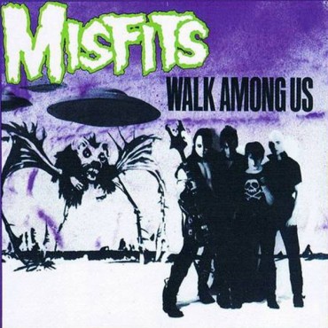
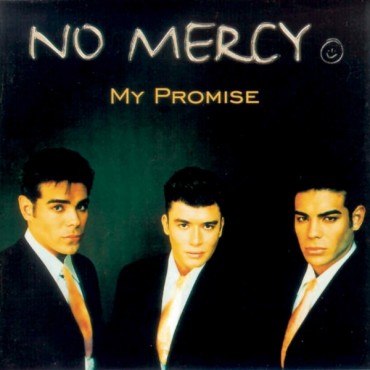
Check out fonts used in famous logos and cover artwork of music albums.
You Might Like These Fonts
These fonts are 100% free for commercial use and each font license has been manually checked. You can click here to refresh with a new set.


