
Grey’s Anatomy Font
About Grey’s Anatomy Font

Grey’s Anatomy is an American medical drama television series that premiered on March 27, 2005, on American Broadcasting Company (ABC).
The condensed sans serif for the TV title on the poster seems to be Helvetica Ultra Compressed. Billy Argel’s Asphaltic Grain is a somewhat eroded version of Helvetica Ultra Compressed and you can download it for free here.
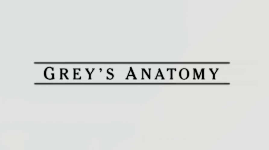
For the serif used for the title text in the title sequences (below), it is Cheltenham, which is a display serif designed in 1896 by architect Bertram Goodhue and Ingalls Kimball, director of the Cheltenham Press.
Download Grey’s Anatomy Font
We are currently unable to find a free alternative or a font similar to the commercial font identified above, and you may need to follow the relevant links above and purchase a font license. At the same time, you can take a look at our curated lists of free or commercial fonts.
You Might Like These Fonts
Below are free and downloadable fonts that can be used for commercial purposes. You can click here to refresh with a new set.
More Fonts in Use
Check out fonts used in famous logos and cover artwork of music albums.